Source
Friday, April 23, 2010
10. Areal Pattern Analysis
Source
9. Bilateral Graph
Bilateral graphs are multitasking graphs in the sense that they depict more than one element while also comparing them to one another.
Source
8. Line Maps
Flow maps such as this line map are useful in conveying general route or direction. They are often used for bus routes to help direct people toward the correct destination. This map illustrates the bus route to college department locations relative to each other for Durham University. Although this particular map does not represent location relative to NESW, one can still navigate their way using it.
Source
*click the link that says 'abstract map' to see the image
Source
*click the link that says 'abstract map' to see the image
7. Photographs
Photographs are also maps because they capture and convey information about an object in space and time. These photos all represent different properties about the places photographed.
6. DEM
Digital Elevation Maps are high-resolution raster-based images produced by the USGS that are used to represent terrain elevations. These hypsometric maps are often 3-D rather than 2-D. This particular topographic map incorporates color to further illustrate dimensions. I am assuming that the white areas are highest in altitude while the brown/gray areas are lowest or flat.
Source
*click the link that says '10 m resolution DEM of Chittenden quad as an image file (chittenden_dem.jpg)' to see photo.
5. Scatter Plot
Scatterplots are often used to visualize trends or correlations between variables. This particular plots shows a strong (because the points tightly surround the trendline), positive (because the trend is going up and to the right) correlation between white fertility and Bush's Share of vote. Basically, white women with more children were more likely to vote for Bush. Statistical representations such as this one make it very easy to interpret data.
Source
*must click link on the page that says "a scatter plot" in order to see the image.
Source
*must click link on the page that says "a scatter plot" in order to see the image.
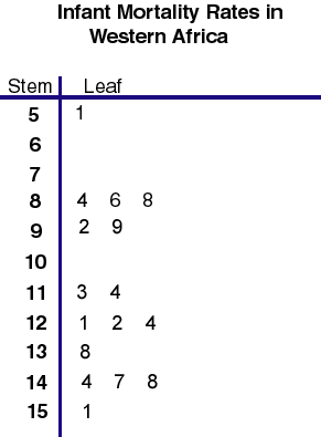
4. Stem & Leaf Plot
This stem and leaf plot is used to display the distribution of infant mortality in Western Africa. It is hard to deduce the mode of this plot because the distribution is similar at multiple values.
Source
Source
Subscribe to:
Posts (Atom)