This topographic (hypsometrical) map contours the depths of water bodies (i.e. ocean floors). Its contour intervals are called isobaths and these maps are often used for deep sea navigation and the study of past ocean floors. They are obtained through depth sounding.
Source
Friday, April 23, 2010
52. Hypsometric Maps
Source
Hypsometric map gives information on the 'relief' of earth's surface (elevation) using contours or shading such as the map on the left.
51. Ideogram
Source
Ideograms are cryptic graphic symbols that represent ideas about place. The image to the left is a map of a gene. Each color (strip of color) represents a different gene. This ideogram allows the genes to be mapped out on the chromosome because they can't be observed. It also allows geneticists to keep track of genes and see how they translocate or "move" to another during replication.
50. Isoline Map
Isoline maps and contour maps are synonymous. They use intervals to depict change in the measured variable. This is an isoline map of the January temperatures in Australia. According to this isoline map, the difference between each line is 10deg F.
Source
Source
49. Topographic Map
Source
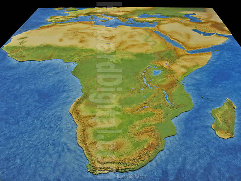
Topographic maps such as this one represent the natural features of a land mass. As you can see, Africa is mostly desert, flat terrain, and jungle. Maps such as these use a variety of methods to convey information (i.e. color, contouring, etc.).
48. Line Graph
Line graphs can serve as maps for continuous data such as sound. This graph allows us to see that sound travels as a wave and not like individual particles. It also lets us know the frequency of the wave; according to this graph this is a sine wave.
Source
Source
47. Magnetic Resonance Imaging
MRI's are also a form of remote sensing as well as mapping. They allow healthcare professionals to observe and map out the inside of the human body in a non invasive manner. They serve as maps because many doctors would not be able to treat their patients without images such as these. Thus serving as navigational tools for physicians.
Source
Source
46. Nominal Area Choropleth Map
source
This map is also a Bivariate Choropleth because it maps two variables--1) homeowners 2) race of homeowners.
45. Isopleth
Yet another type of contour map, these maps display data for many variables in the same manner as other contour maps (i.e. isohyet). This particular map represents the sound levels in a given area. According to this map, noise levels are lower in the less developed areas.
Source
Source
44. GIS Map
Source
43. Isohyets
Above is an Isohyetal map (aka rainfall map). These maps spatially represent rainfall levels (in inches) in a given area. According to this map, Waglan is only expected to receive 20-30 inches of rain.
42. Lorenz Curve
This graph is also known as the Laffer Curve, an economic representation of how taxation will benefit a country. In this graph, if taxes are too low no profit will be made and the same for if they are too high. However, if they tax moderately, the most profit will be a result. This is an example of a Lorenz curve. The curve represents the actual distribution of profit.
Source
Source
41. Index Value Plot
Index value plots operate using index values rather than absolute numbers. Because of this, they are able to point out discrepancies in data. The plot to the left shows the index values for air, soil, and wind indices in the span of a year.
Source
Source
40. Conformal Projections
This map of the world is also known as a conformal (meaning it holds 'true shape') projection. It is an excellent representation of latitudinal and longitudinal coordinates and is often used for navigation.
Source
Source
39. Flow Map
Source
This line map is also known as a flow map; it shows the rate of flow so that someone may avoid congestion. For example, many GPS systems come equipped with a traffic flow embedded in the maps so that you know what routes are most congested. In this map, the thicker lines indicate a heavier traffic flow.
38. Kriging
source
37. Proportional Circle Map
Source
These are a variation of dot density maps; rather than showing density, these maps use circles instead of dots. The circles are proportional to the size of the measured variable rather than the area it covers. More specifically, this is a continuously graded proportional circle map. It indicates that the largest (not densest) Mexican populations are in California and Texas.
36. Data Visualization
Source
35. Statistical Map
Source
This is an example of a statistical map. It is the 3-D view of an the electron cloud in a magnetron. These types of maps are extremely useful visualizations methods for subjects such as physic and chemistry because they help illustrate processes that cannot be observed by the human eye. These images are formed using the mathematical definitions of space and time.
34. Concept Map
Source
While most maps visualize/organize the physicalities of earth, concept maps do the same for information. These are basically the maps of a thought, theory, or idea. Not only are they guides for understanding information, but they also convey one's thoughts to another. The concept map shown is a map of how to map concepts (ironic huh?) Search engines use this type of mapping to organize results when an inquiry is made (i.e. google, yahoo, etc.)
Subscribe to:
Posts (Atom)