
Friday, April 23, 2010
53. Bathymetry Map
This topographic (hypsometrical) map contours the depths of water bodies (i.e. ocean floors). Its contour intervals are called isobaths and these maps are often used for deep sea navigation and the study of past ocean floors. They are obtained through depth sounding.
 Source
52. Hypsometric Maps

Hypsometric map gives information on the 'relief' of earth's surface (elevation) using contours or shading such as the map on the left.
51. Ideogram

Ideograms are cryptic graphic symbols that represent ideas about place. The image to the left is a map of a gene. Each color (strip of color) represents a different gene. This ideogram allows the genes to be mapped out on the chromosome because they can't be observed. It also allows geneticists to keep track of genes and see how they translocate or "move" to another during replication.
50. Isoline Map

Source
49. Topographic Map
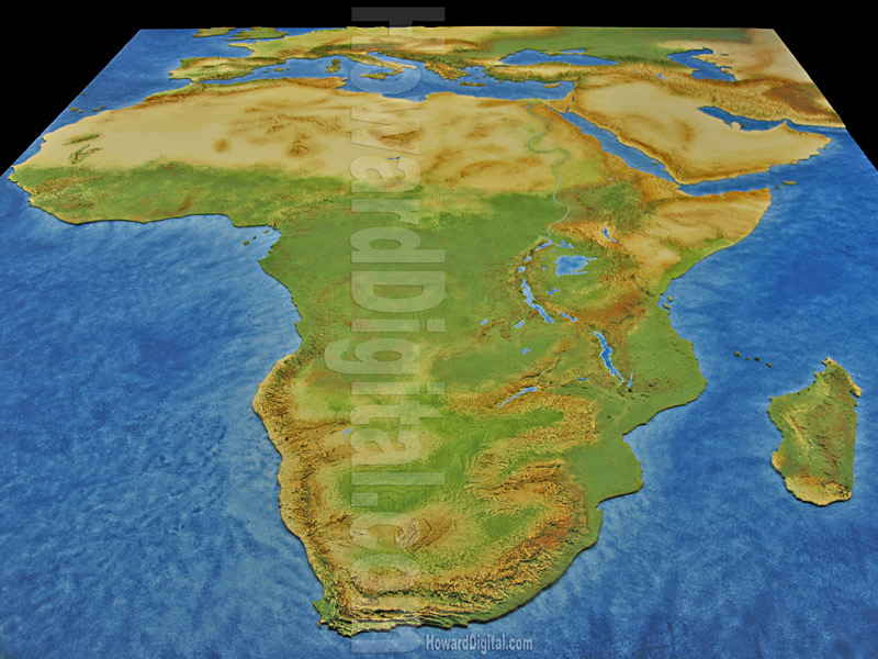
Topographic maps such as this one represent the natural features of a land mass. As you can see, Africa is mostly desert, flat terrain, and jungle. Maps such as these use a variety of methods to convey information (i.e. color, contouring, etc.).
48. Line Graph

Source
47. Magnetic Resonance Imaging

Source
46. Nominal Area Choropleth Map

This map is also a Bivariate Choropleth because it maps two variables--1) homeowners 2) race of homeowners.
45. Isopleth

Source
44. GIS Map

Source
43. Isohyets

42. Lorenz Curve

Source
41. Index Value Plot

Source
40. Conformal Projections

Source
39. Flow Map

This line map is also known as a flow map; it shows the rate of flow so that someone may avoid congestion. For example, many GPS systems come equipped with a traffic flow embedded in the maps so that you know what routes are most congested. In this map, the thicker lines indicate a heavier traffic flow.
38. Kriging

source
37. Proportional Circle Map

Source
These are a variation of dot density maps; rather than showing density, these maps use circles instead of dots. The circles are proportional to the size of the measured variable rather than the area it covers. More specifically, this is a continuously graded proportional circle map. It indicates that the largest (not densest) Mexican populations are in California and Texas.
36. Data Visualization

Source
35. Statistical Map

This is an example of a statistical map. It is the 3-D view of an the electron cloud in a magnetron. These types of maps are extremely useful visualizations methods for subjects such as physic and chemistry because they help illustrate processes that cannot be observed by the human eye. These images are formed using the mathematical definitions of space and time.
34. Concept Map

While most maps visualize/organize the physicalities of earth, concept maps do the same for information. These are basically the maps of a thought, theory, or idea. Not only are they guides for understanding information, but they also convey one's thoughts to another. The concept map shown is a map of how to map concepts (ironic huh?) Search engines use this type of mapping to organize results when an inquiry is made (i.e. google, yahoo, etc.)
33. Multivariate Map
This is also a unclassified choropleth map. The changing colors represent relationships between plant growth and the variables being compared. This particular map uses the multivariate clustering technique.
32. Parallel Coordinate Map

These maps graphically represent each variable on its own y axis and are used to show relationships between variables. the points where all the lines intersect indicate changes or similarities.

30. Dot Distribution Map

Source
Dot distribution maps are another type of planimetric map that are often used to denote densities. By looking at this map, you can tell that the NE coast has the highest density of whatever variable is being presented. In this case it is bird populations. However, density can sometimes be ignored because you don't know if they took area into account with this type of map. This is also an example of a statistical map.
29. Cartogram

28. Climograph
 These graphs are basically the overlapping of a line graph and histogram. They are used to relate temperature and rainfall over a given year. This particular graph indicates that rainfall peaked in August, shortly after the temperature peaked in July. These types of graphs can be useful in determining the effects of global warming.
Source
27. Cadastral Map

Source
26. Star Plot

Source
25. B&W Aerial Photos

Source

23. Box Plot

Source
22. LIDAR

Source
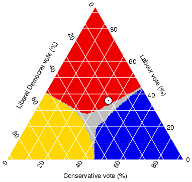
21. Triangular Plot
Source
 This plot graphically depicts three different ratios and where they intersect is the constant. The white circle represents the point of a certain election and where it stand in regards to the type of votes.
20. Unclassed Choropleth Map

Source
19. Classed Choropleth Map

Source
18. PLSS
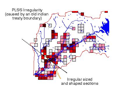
The Public Land Survey System (PLSS) is one of the two national coordinate systems. It is a grid based off of a series of 34 principle meridians and baselines (week 3 notes). It "systematically" coordinates land into townships (N/S) and ranges (EW). This system is used to show ownership.
17. Contour Map

Source
Contour maps are very versatile in regards to the information they represent. Contour maps can portray 3-D information in a 2-D format. Each line is called a contour interval and represents a point where there is no elevational change. This particular map shows elevational change in the form of depressions. The two purple regions represent the lowest points at -4100 feet.
16. Mercator Projections

Source
15. Histogram

Source
14. Windrose

This type of map diagram is used to depict the general wind direction at a certain location during an allotted observation period. This particular diagram shows a strong wind in the NW direction nearly 5% of the time.
Source
13. Doppler Radar

Source
12. Propaganda Map

Source
11. Similarity Matrix

Source
10. Areal Pattern Analysis

Source
9. Bilateral Graph

Bilateral graphs are multitasking graphs in the sense that they depict more than one element while also comparing them to one another.
Source
8. Line Maps

Source
*click the link that says 'abstract map' to see the image
7. Photographs

Photographs are also maps because they capture and convey information about an object in space and time. These photos all represent different properties about the places photographed.
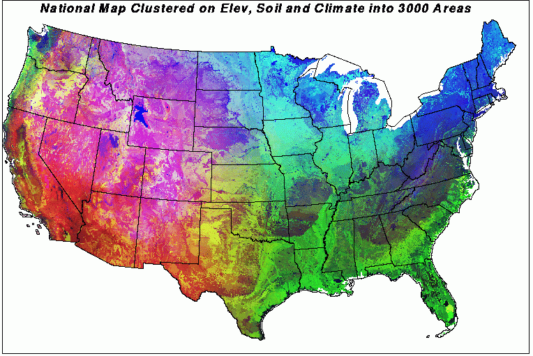
6. DEM

Digital Elevation Maps are high-resolution raster-based images produced by the USGS that are used to represent terrain elevations. These hypsometric maps are often 3-D rather than 2-D. This particular topographic map incorporates color to further illustrate dimensions. I am assuming that the white areas are highest in altitude while the brown/gray areas are lowest or flat.
Source
*click the link that says '10 m resolution DEM of Chittenden quad as an image file (chittenden_dem.jpg)' to see photo.
5. Scatter Plot

Source
*must click link on the page that says "a scatter plot" in order to see the image.
4. Stem & Leaf Plot

Source
Subscribe to:
Comments (Atom)